The new paradigm of responsive email frameworks
Introduction
Email is one of the best ways to engage with your clients, especially during the holiday season. However, if you want to stand out, no matter how beautiful your emails are, you need to make sure they render correctly in your reader’s inbox, regardless of what email client they’re using. Creating responsive email is not an easy task considering there is no standard in the way email clients render HTML, so probably your email would look different on Gmail than on Outlook or other email client.
The world is turning Mobile
An article on IBM’s www.mobilebusinessinsights.com, demonstrates the power of portable devices over the last few years. Scott Steinberg (Keynote speaker and Bestselling Author) wrote some interesting statistics about this:
- A staggering 1.4 billion smartphones were sold in 2015 (App Annie).
- More than 1 billion connections were made last year, and this figure is expected to increase to 2.6 billion in the next four years (App Annie).
- More than 3 billion people worldwide now use the internet (Time), and 80 percent of them access it from smartphones (Smart Insights).
- Of the 1.8 hours average users spend online on their smartphones each day, mobile apps account for 89 percent of this media time (Social Media Today).
- The majority of growth in digital media time is now being generated by the use of mobile devices, with desktop computers increasingly becoming a secondary device (Marketing Land).
- By 2018, 8 in 10 email users will likely access their email accounts from their mobile devices (emailmonday).
- More than 50 percent of people immediately pick up and begin using their smartphones after they wake up (ExpressPigeon).
- Almost 60 percent of marketers say mobile apps are crucial to creating a cohesive customer journey (Salesforce).
- Using a range of popular mobile messaging apps, more than 2.8 billion people reached out and made connections using their mobile devices in 2015 (App Annie).
- Wearables promise to expand the mobile market. From connected watches to wristbands, 78.1 million wearable devices shipped in 2015 (International Data Corporation).
Noting these mobile stats, it’s clear that mobile devices are overtaking desktop year to year and this makes email developing more challenging given the fact that the technology used to render the HTML in email clients hasn’t evolved since the late 90’s.
The struggle is real
Creating a mobile responsive or mobile friendly email from scratch is no easy task. As we mentioned before, each email client renders emails differently so the build process for an email that has to behave differently from mobile devices to desktop can take several.
Most web developers think that if they know HTML and CSS they would be able to take up the task of building a mobile responsive email, but later they find out that they can’t use the same methodology or code best practices from web to email. Take a look for example at the fixes section of this email template to have an idea of all the considerations to be taken for each email client.
Introducing the email development frameworks
What if you could develop emails the same way you develop web pages? What if there was an email version of Bootstrap? Luckily, these questions can be answered today thanks to the development of two frameworks: Foundation and MJML. The main goal of these two frameworks is to provide you with an abstraction HTML layer where you could code emails, just as if you were coding a web page using Bootstrap, using special HTML tags which can then be rendered as HTML and inline CSS tailored specifically for email to make your emails look flawless on any email client.
Using the frameworks
Given the following email example:
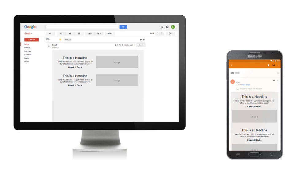
Using MJML we can easily build the main content of this email:
<mj-container>
      	<mj-section background-color="#EEEEEE">
            		<mj-column background-color="#EEEEEE">
                  		<mj-text font-style="Bold" font-size="20" font-family="Arial" color="#000" align="center" padding="0">
                    		This is a Headline
                  		</mj-text>
                  		<mj-text font-style="regular" font-size="12" font-family="Arial" color="#000" align="center" line-height="1.5">
                    		Neyla of indie band The Lumineers swings by our office to meet her namesake dress!
                  		</mj-text>
                  		<mj-text font-style="Bold" font-size="15" font-family="Arial" align="center" padding="0">
<a style="text-decoration:none;color:#000;font-weight:bold;" href="#">Check It Out »</a>
                  		</mj-text>
            		</mj-column>
            		<mj-column background-color="#EEEEEE">
                  		<mj-image src="https://placehold.it/280x90">
            		</mj-column>
      	</mj-section>
	</mj-container>
Look at the code from above and notice how there are some helpful tags like <mj-wrapper>, used to englobe two or more sections or <mj-group>, used to keep together two or more columns as a group.
As every HTML document, MJML also needs <head> and <body> tags traduced as every MJML tag to <mj-head> and <mj-body>. You can also add some class to your MJML tags and include styles between <mj-attributes> tag. For further details and documentation, you can visit the MJML documentation page.
Foundation works similar to MJML. It uses a grid system with almost the same tags:
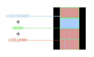
<CONTAINER> establishes the width the email content is going to measure. <ROW> tag creates as the word indicates a row to contain one or many columns. <COLUMN> will create a number of columns necessary to display your email elements correctly.
Foundation works on a twelve column grid. One thing to remark that differs between both frameworks is that while Foundation allows you to set your column width applying attributes like “large”, “medium” or “small”, MJML automatically adjust the column width depending on the amount the row is going to include. So for instance, if your email uses a four-column grid, each one is going to be 25% width. Same if you are using a two column grid, each one is going to be 50% width of the complete row size.
A positive and helpful feature Foundation has is the use of SCSS styling for more experienced users and some basic layouts built as models for beginners.
Compiling to 1990’s HMTL
The best feature of both frameworks is that they are both based on Node packages, meaning you can use the command line to compile the framework’s HTML into one single HTML file with inline CSS to utilize in your emails:
Which one should I use?
There’s no right or wrong in choosing one or the other. Both are very useful and reduce remarkably the amount of code lines. Perhaps Foundation allows you to include SASS which can be a powerful tool if you are going to work on several complex emails but choosing between one of them depends explicitly on the developer preferences.
Conclusion
Here at Devs United we believe that the email build process should be similar to the Web build process and we use these tools to speed up dramatically our development time. We let these great frameworks do most of the heavy lifting, then we compile to the final HTML and CSS and make the necessary edits. This way we can keep the raw files in source control and have a more organized approach to email development.
Don’t hesitate in contacting us if you want to learn more about our HTML skills and other service offerings we have.